
What you get back, free
Usually within 30 seconds of submitting. No account needed to see it.
A score on every criterion
Not one number — the official rubric, marked criterion by criterion, with the reasoning for each.
Every error, quoted and corrected
Pulled from your own sentences and ranked by severity: what costs marks, what costs clarity, what is only style.
First-language interference
Which mistakes are the ones speakers of your language typically make, why they happen, and how to stop.
The lessons that fix them
Matched to the errors actually found in your writing — and readable without an account.
A model answer to compare againstfree account
A high-scoring response to this same task, so you can see what the band above you looks like.
Your essay, rewritten one level upPremium — in the trial
The same ideas in stronger language, with a before-and-after list of every change that moved the score.
IELTS Writing · IELTS Task 1
Water Consumption by Sector
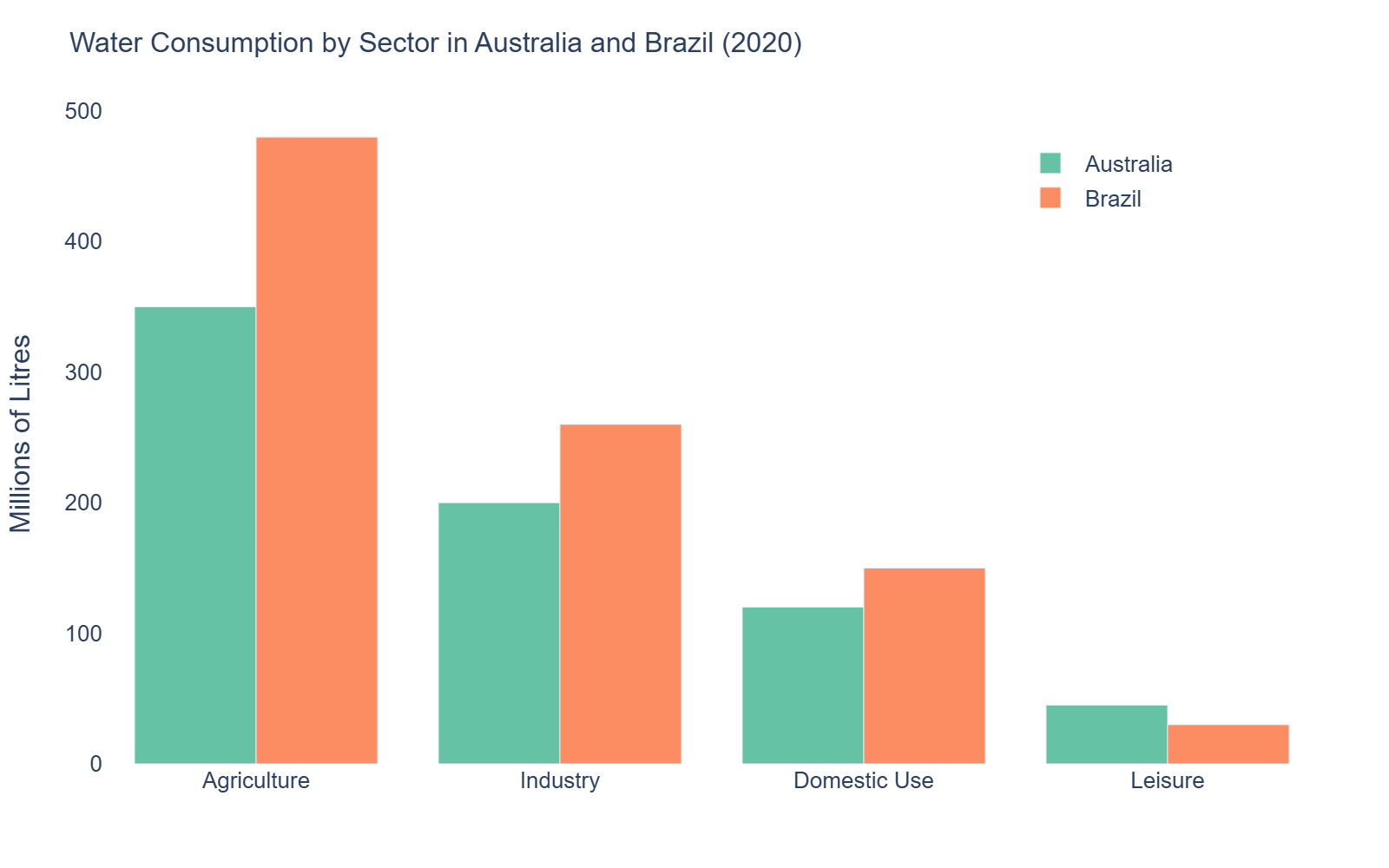
The bar chart below shows water consumption in millions of litres across four sectors — agriculture, industry, domestic use, and leisure — in two countries, Australia and Brazil, in 2020. Summarise the information by selecting and reporting the main features, and make comparisons where relevant.
IELTS Academic Task 1 is a 150–200 word, ~20-minute description of a chart, graph, table, or process. It is scored on Task Achievement, Coherence & Cohesion, Lexical Resource, and Grammatical Range. The two biggest score-killers: no overview (caps Task Achievement below Band 5) and treating data as opinion (Task 1 describes — it never explains causes or comments).
1. Introduction (paraphrase the question)
~25 words- Paraphrase the prompt in your own words — never copy the question sentence verbatim.
- State what the visual shows (bar chart / line graph / pie chart / table / process) and the time span or range it covers.
e.g. “The line graph illustrates changes in coffee consumption across three countries between 1990 and 2020.”
2. Overview (key trends)
~45 words- The single most important sentence for your score: summarise the 1–2 most striking features — the highest/lowest, the biggest change, the overall trend.
- Stay qualitative here — no specific numbers, just the big picture.
- Useful framing: "Overall, …" / "It is clear that …" / "The most striking feature is …"
e.g. “Overall, while consumption rose in all three countries, the steepest increase occurred in...”
3. Body Paragraph 1 (first set of detail)
~55 words- Describe one logical group of data — the most prominent trend, the highest categories, or the first part of a process.
- Use specific figures and units (22%, 15 million, doubled, halved).
- Vary your comparison language: rose by / fell to / remained stable at / fluctuated around.
4. Body Paragraph 2 (second set of detail)
~55 words- Describe the remaining data — the other categories, countries, or stages — or whatever contrasts with paragraph 1.
- Keep using exact figures; a short comparative remark is fine, but do not explain why.
Common Pitfalls
- Omitting the overview. It links directly to Task Achievement — a missing or vague overview caps your band below 5.
- Explaining causes or giving opinions ("This is because people prefer…"). Task 1 only reports what the visual shows.
Writing Tips
- The overview needs no numbers — just name the biggest feature. Save the exact figures for the body paragraphs so the two jobs stay separate.
- Lexical range in change words is a direct scoring lever: learn 6–8 movement verbs (surge, plummet, climb, dip, level off, fluctuate) and 4–5 degree adverbs (dramatically, steadily, marginally, sharply).
Turns on the first-language analysis — which of your errors are the ones speakers of your language typically make, and why. It's the part of the report people tell us they can't get anywhere else.
One free evaluation. No account, no card.